Now Using The Twenty Fifteen Theme
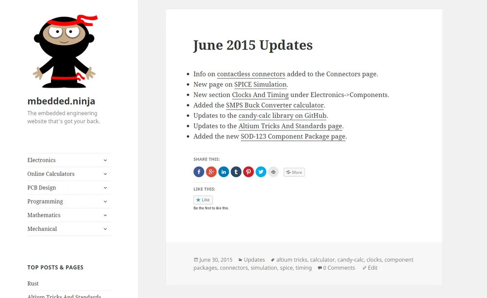
I have recently upgraded this sites theme from Avada to Twenty Fifteen.
I purchased the Avada theme for US$58 a few months ago, mainly because I was looking to “get with the cool kids” and start using a responsive theme that would looks good on both phones and tablets as well as the standard computer screen. I specifically went with Avada because it was the most popular paid for theme on ThemeForest (I was a sheep in that regard).
However, I soon became pretty disappointed with Avada. The built-in defaults were not that good at all, and when it came to tweaking it (with a child theme of course) everything turned into a nightmare because of the theme’s complicated, deeply nested and non-intuitive folder structure., along with it’s complicated PHP files which are riddled with very specific, nested if/else if/else statements.
Attempting to change anything ended up taking 5x as long as it really should of. After a few months of wrestling with the Avada monster I decided it was time to go simple.
The Twenty Fifteen theme (the default Wordpress theme in 2015) offered me the simplicity I needed. Apart from looking great out of the box, it has been simple (so far) to add and modify a child theme for it.
The folder structure is simple, and the added features both powerful and good looking but well integrated. The biggest issue I will have with converting will be trying to fit wide elements onto the relatively narrow (approx. 630px) post-content space, when viewing on a computer screen. This includes some of the bigger calculators such as the PCB Track Current Capability (IPC-2152) calculator (as of Dec 2017, this calculator has moved to https://ninjacalc.mbedded.ninja/).


