matplotlib

Importing
matplotlib, just like numpy, is one of those libraries which has so much legacy behind the import statement that it’s worth breaking Python style rules and using the at keyword to change the name of the imported library. Traditionally, matplotlib.pyplot is imported as plt, with the statement:
import matplotlib.pyplot as pltUsing subplots
# Create two plots, in a grid with 2 rows and 1 column# (plots will be stacked vertically)fig, axs = plt.subplots(1, 2)
ax1 = axs[0]ax2 = axs[1]
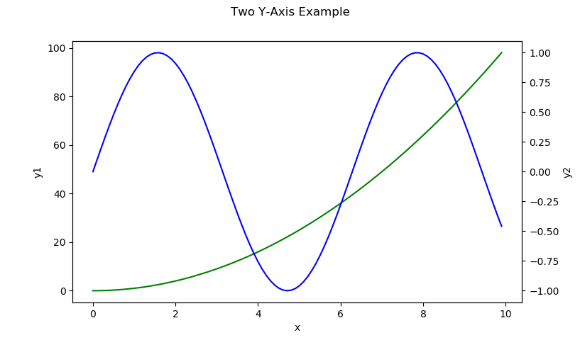
# Use each axX object normally...Two Y-Axis Example
import matplotlib.pyplot as pltimport numpy as np
x = np.arange(0, 10, 0.1)y1 = x**2y2 = np.sin(x)
fig, ax1 = plt.subplots()
ax2 = ax1.twinx()
ax1.plot(x, y1, color='g')ax2.plot(x, y2, color='b')
fig.subtitle('Two Y-Axis Example')ax1.set_xlabel('x')ax1.set_ylabel('y1')ax2.set_ylabel('y2')
plt.show()
This will produce the following graph:
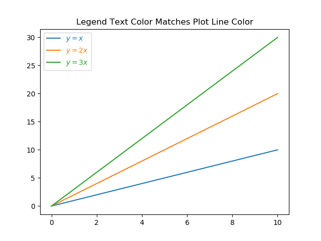
Matching The Legend Text Color To The Plot Line Color
It can be a handy visual aid to set the legend color to the same color as the corresponding line on the plot. This can be done with the following code:
fig, ax = plt.subplots()
x = np.linspace(0, 10, 100)y_x = xy_2x = 2*xy_3x = 3*x
ax.plot(x, y_x, label='$y = x$')ax.plot(x, y_2x, label='$y = 2x$')ax.plot(x, y_3x, label='$y = 3x$')
leg = ax.legend()
# Set legend text color to line colorfor line, text in zip(leg.get_lines(), leg.get_texts()):    text.set_color(line.get_color())
plt.title('Legend Text Color Matches Plot Line Color')
plt.savefig('legend-text-color-matches-plot-line-color.png')
This will produce a plot which looks like:
Creating Animated Plots
When using the pillow writer, the GIF will not loop. When using the imagemagick writer, the GIF will loop.
Using The Basemap
from mpl_toolkits.basemap import BasemapUsing A Specific Axis
Rather than Basemap automatically using/creating an axis for you, you can instead take a more object-orientated approach (which I recommend) and provide Basemap with the Axis object to use for drawing the map:
fig = plt.figure(figsize=(15,10))ax = fig.add_subplot(111)map = Basemap(ax=ax) # Pass in the axis object to draw the basemap in# Proceed as usualAdjusting The Size Of The Map
You can adjust the size of a basemap by calling plt.figure(figsize(15,15)) before making any calls to the Basemap class:
from mpl_toolkits.basemap import Basemapimport matplotlib.pyplot as plt
plt.figure(figsize(15, 10)) # Adjust the size of the mapmap = Basemap()
Setting Aspect Ratio Equal For A 3D Plot
Unfortunately, there is no built-in support for forcing the aspect ratio to be equal for a 3D plot. However you can do it yourself by calculating a bounding box from your plot objects and setting the limits yourself. Below is a function you can copy/paste into your own code. Pass in the Axes object to set the aspect ratio to equal. Note that you have to add the objects to the axes BEFORE calling this function.
def set_axes_equal(ax) -> None:    """    Make axes of 3D plot have equal scale so that spheres appear as spheres,    cubes as cubes, etc.  This is one possible solution to Matplotlib's    ax.set_aspect('equal') and ax.axis('equal') not working for 3D.
    Args:      ax: A matplotlib axis object.    """
    x_limits = ax.get_xlim3d()    y_limits = ax.get_ylim3d()    z_limits = ax.get_zlim3d()
    x_range = abs(x_limits[1] - x_limits[0])    x_middle = np.mean(x_limits)    y_range = abs(y_limits[1] - y_limits[0])    y_middle = np.mean(y_limits)    z_range = abs(z_limits[1] - z_limits[0])    z_middle = np.mean(z_limits)
    # The plot bounding box is a sphere in the sense of the infinity    # norm, hence I call half the max range the plot radius.    plot_radius = 0.5*max([x_range, y_range, z_range])
    ax.set_xlim3d([x_middle - plot_radius, x_middle + plot_radius])    ax.set_ylim3d([y_middle - plot_radius, y_middle + plot_radius])    ax.set_zlim3d([z_middle - plot_radius, z_middle + plot_radius])
# Example usage belowfig = plt.figure()ax = fig.gca(projection='3d')
# Add objects for axis here...
ax.set_aspect('equal')plt.show()